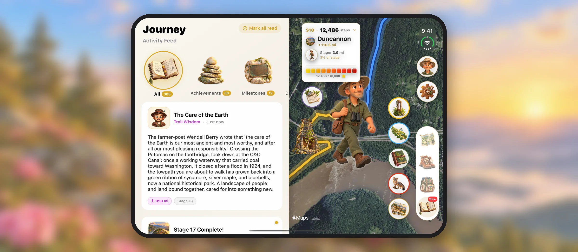
A phone that opens is not a bigger phone. That was the first thing we learned redesigning Nature Steps: Appalachia for iPhone Duo. Folded, it is the iPhone you already know. Open, it is closer to a small book, and you can hold it two ways: flat on a table, wider than it is tall, or upright in your hands, taller than it is wide. One app has to feel at home in all three.
Here is how we went about it: what Apple asks of apps on the Duo, what we built, and a few things we got wrong on the way.
Start with what Apple asks
Apple's guidance for iPhone Duo is short, and most of it is about letting go of assumptions. One line changed how we worked more than any other.
On iPhone Duo, the device's orientation doesn't tell you what shape your app is. Apple, Prepare your app for iPhone Duo
The open Duo can be wide or tall depending on how you hold it, and it does not follow the orientations an app says it supports. So nothing in our layout asks which way the phone is turned any more. It measures the space it has been given and arranges itself to fit.
Two more lines followed from that one. Apple asks developers not to treat a wide iPhone app as an iPad app, so we stopped choosing layouts by device and started choosing them by size. And with the iOS 27.1 SDK, tab bars and toolbars can become vertical, running down the side of the screen instead of along the bottom. Anything that assumed a bar along the bottom edge had to be ready for that.
Three shapes, one app
Before drawing anything, we wrote down what each shape is for.
The phone in your pocket
Folded, the Duo is a phone, and we treat it like one. It stays upright, as all our iPhone screens do. The map fills the screen and every page opens over it, just as on any iPhone. The one change you can see is the tab bar, which now runs down the right edge.
map · journey · steps · field journal · patches
The map, with a page beside it
Laid flat, the app becomes two panes: the page you are reading on one side of the fold, the map on the other, with your walker still in view. You can read a story about the Potomac while you look at the Potomac.
page on the left · trail on the right
A taller screen
Held upright, the open Duo is tall and nearly square. The map has room to breathe, and the controls stay together down the right edge, where a thumb can find them.
full map · controls on the right
The map, with a page beside it
The heart of our app is a map: your walker on the real trail, moving north as you walk. On a phone, every other screen covers it. You open the Field Journal and the trail goes away.
The open Duo gave us room to stop doing that. The page beside the map can be any part of the app: the Journey feed, your step count, the Field Journal, the patches, the Naturalist's Notebook. Close it, and the map takes the whole screen again.
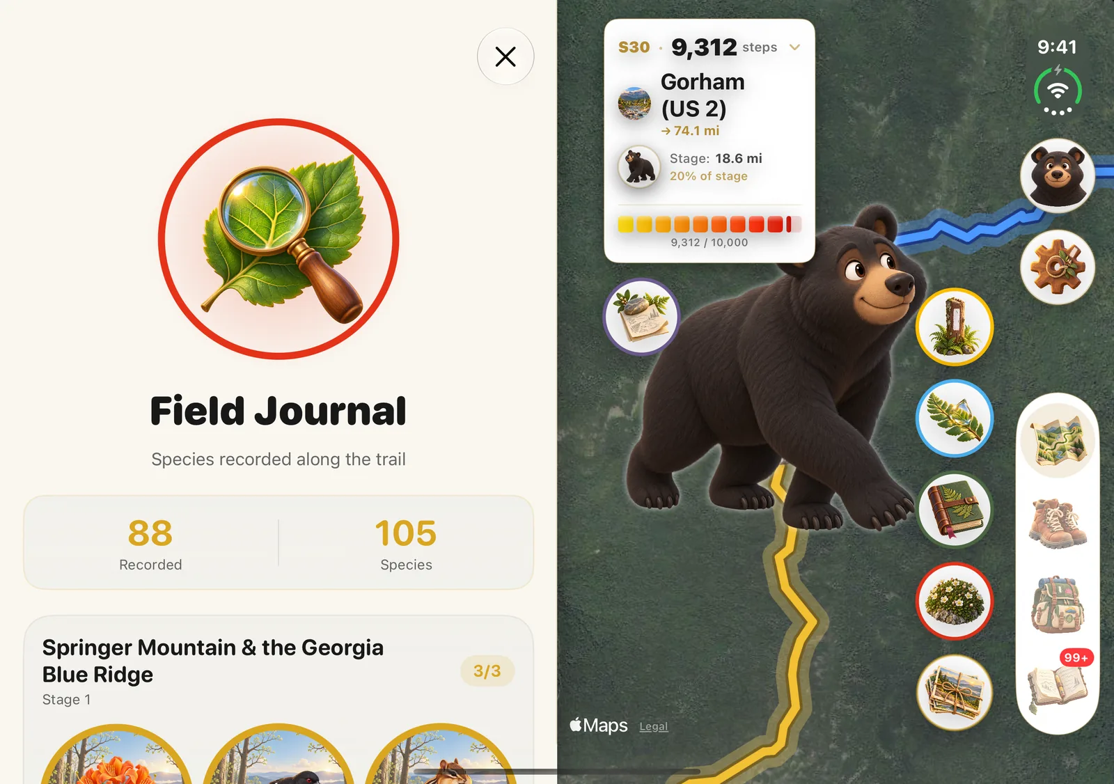
We kept the controls where a thumb can reach them on a wide screen: down the right edge, in a column, rather than spread across the bottom. That turned out to be the same place the system wants its own bars on the Duo, which is a good sign you are going with the grain of the platform rather than against it.
A tab bar that moves to the side
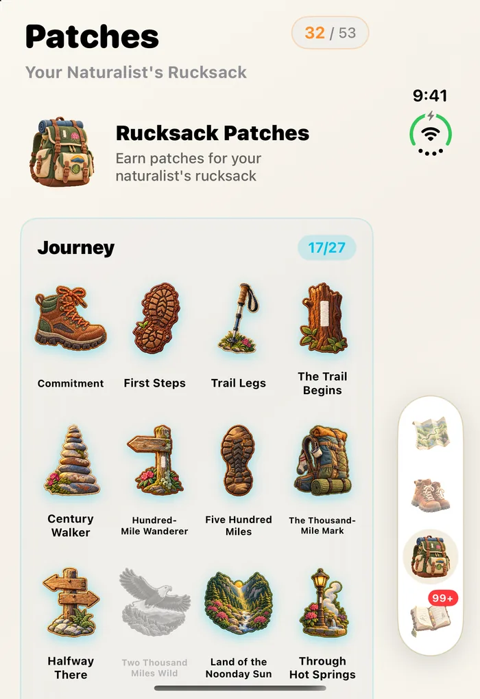
The tab bar was our biggest single change. On every other iPhone it sits along the bottom. On the Duo it becomes a slim rail on the right, closed or open, and the screen gets its full height back. It is still our own illustrated tab bar, with the same hand-drawn map, boots, rucksack and journal. We wanted the app to look like itself, just arranged for a different shape.
Three layouts for one welcome
Onboarding was where we learned the most, because it is where small differences show. Each welcome page has the same parts: an illustrated guide, a title, a card of text and a button. On a phone they stack in one column. Open and upright, they still stack, but larger. Open and flat, they split: the illustration on one side of the fold, the words and buttons on the other, so nothing you need to read runs across the crease.
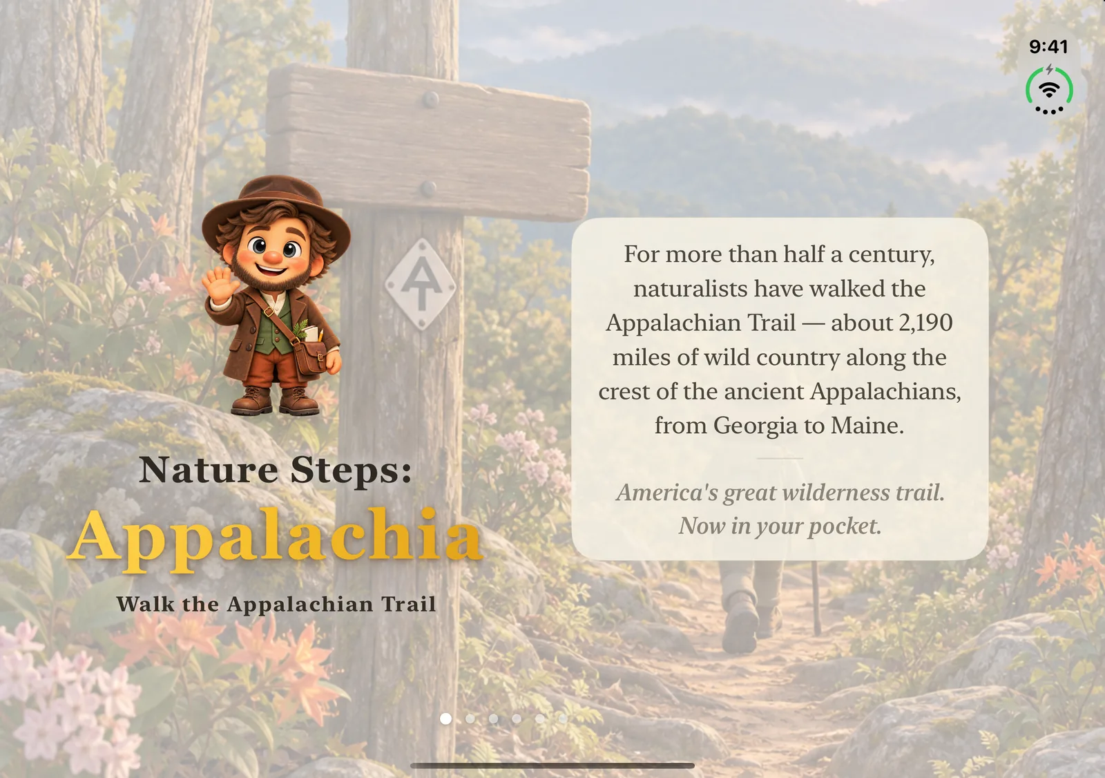
Our first version fitted each page to its own contents, and that is exactly what made it look wrong. Page to page, the card moved a little, the title moved a little, the button was a little wider or narrower. On a phone you hardly notice. Open, with that much room, you notice every point of it. Swiping through felt like the pages were being shuffled.
So we pinned things down. Every card is the same height on every page, and the text inside it is sized to fit rather than the card being sized to the text. The guides, titles and cards sit at the same height on every page. The buttons are the same width, 360 points, whether the Duo is held flat or upright. And the pages that are only a few buttons, like choosing a language, sit centred instead of floating at the top of a large empty pane.
Two things to watch, if you are doing this yourself. First, don't solve misalignment by shrinking things. Our first fix made the cards smaller so they would match, and it was rightly sent back: align them, don't miniaturise them. Second, a layout that measures itself can jump on its first frame as it finds out how big it is. Ours bounced on the very first screen anyone sees. The fix was to hold the page back until it had measured, and then show it, still.
One design, every version of iOS
The Duo arrived in the same year as Apple's Liquid Glass design, and it would have been easy to redraw the whole app in glass, or to make two apps: a new look for new phones and the old one for everyone else. We did neither. Nature Steps keeps its own look everywhere: the illustrated tab bar, the solid map controls, the cream pages. The same design runs on every iPhone, and the app still supports iOS 18.
The one place we follow the system is the close button. On iOS 26 and later it is Apple's own glass close button, the same one you see in every other app, so closing a page feels the same as anywhere else on the phone. On earlier versions it is a frosted circle in the same place.
It also meant fixing small things everywhere at once. The close button on our map cards sat a little inside the card's right edge instead of lining up with it. On a phone that was a few points no one noticed. On a wide screen it was suddenly obvious, so it is fixed for everyone.
What we would tell another small studio
Test every pose. Closed, open flat and open upright: most of our problems were invisible in two of the three. Measure the space you have, never the device; there should be no question in your code about whether this is a Duo, or which way it is turned. Decide what the big screen is for. For us it was keeping the trail in view, because a bigger copy of the phone layout is not a design. Pin down what should line up, because fixed heights and widths across a flow look calmer than pages that each fit themselves.
Most of the work, in the end, was not about the Duo at all. It was about taking out assumptions the app had carried since it only ever had one shape. The open screen just made them impossible to ignore.
Unfold it on Springer Mountain. The map is on the right.
With thanks to everyone who folded, unfolded and turned the Duo for us, many times over — — The Lost Theory team
Walk the Appalachian Trail
Nature Steps: Appalachia is on the App Store for iPhone, iPhone Duo & Apple Watch.
Download on the App Store →